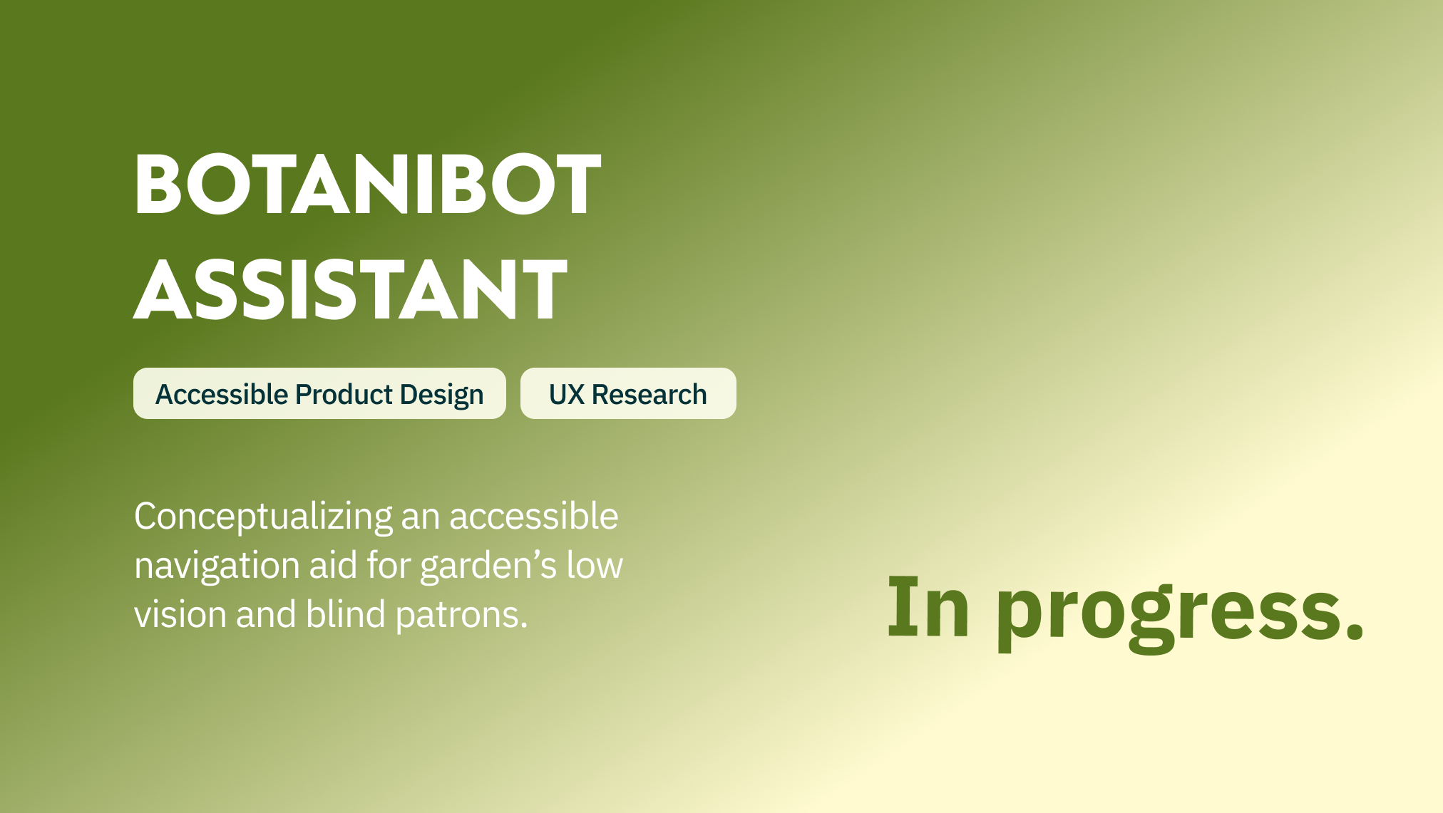

Michigan Daily Music matcher
Reimagining the discovery experience of Ann Arbor's local music scene.
What is the Michigan daily?
The Michigan Daily (TMD) is the biggest University of Michigan student publication that serves the campus population as well as the greater Washtenaw county community. With 500+ members under 10 sections, or teams, content is delivered in both digital and physical format to a readership of 400,000+ and beyond.
the spark
One September evening, a developer of the Swiftie Project and avid music listener, approached our product design team with the question: "What do people have at home that's not here?" With over 4,000 students from freshman class each year (without taking into account transfers or graduate students) coming from outside of the Washtenaw county area where the university is embedded, what role can our student newspaper play in guiding student exploration of Ann Arbor's music community?
What we hatched needed the expertise of the Arts section, a team of writers specializing in media reviews and latest in pop culture, and the Web team (us!), a team of developers and product designers who bring content to life digitally.
I spearheaded research & design for this collaboration project between TMD sections Arts & Web in the Fall of 2023 as the lead product designer.

the Outcome
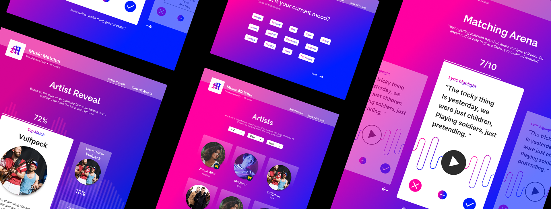
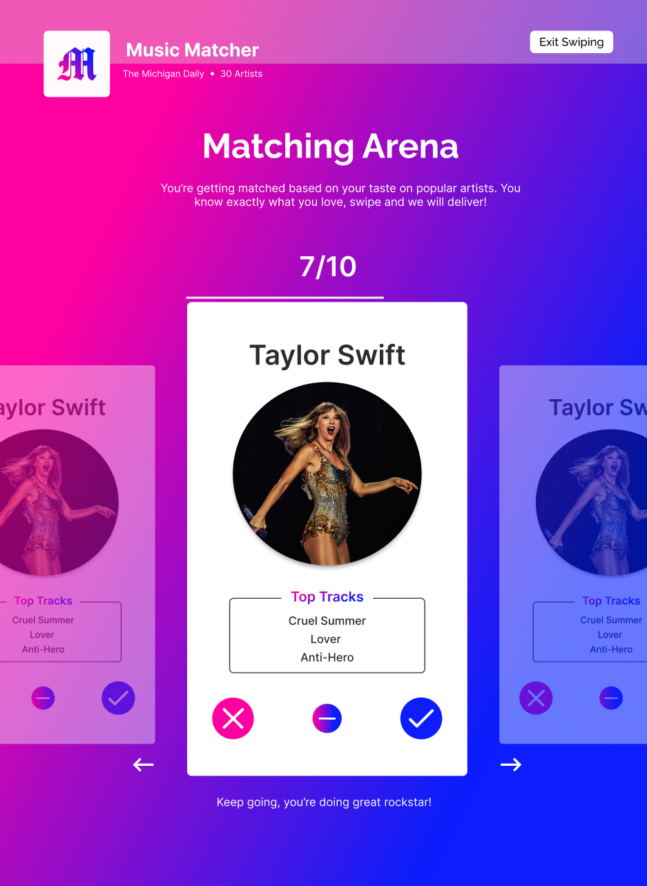
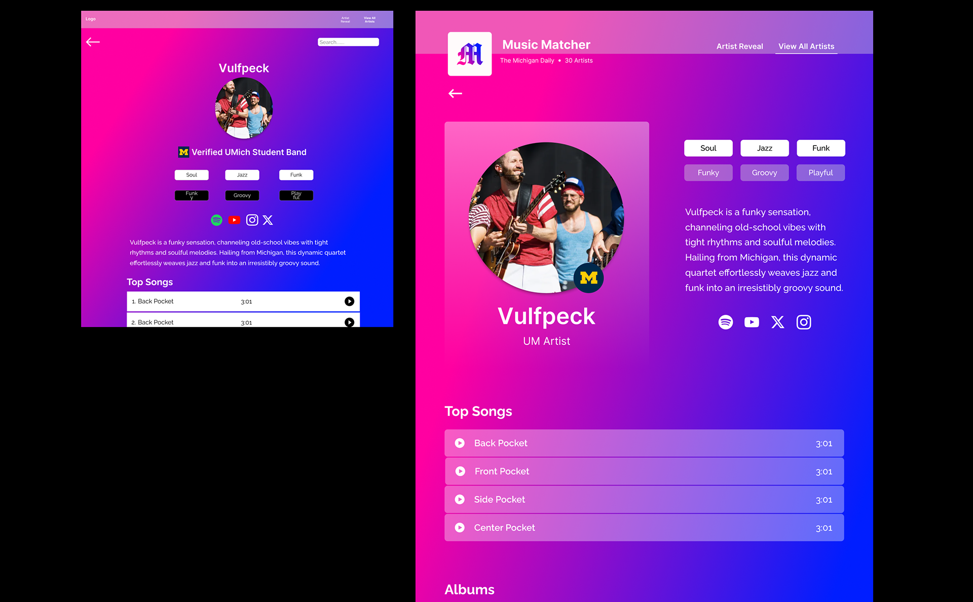
Swipe on Popular Artists
For users who prefer exploring music through a curated artist list of what is familiar, matching is done through the swiping of top artists and their tracks.
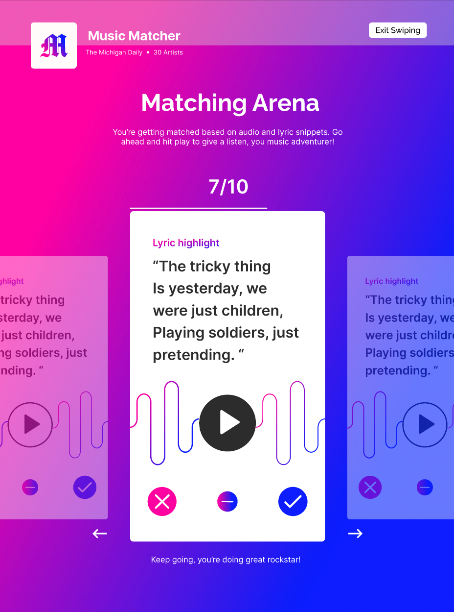
Or Swipe on Song Samples
And users who prefer spontaneous sampling of music will be matched based on their swipes of song highlight lyrics and audio snippets.
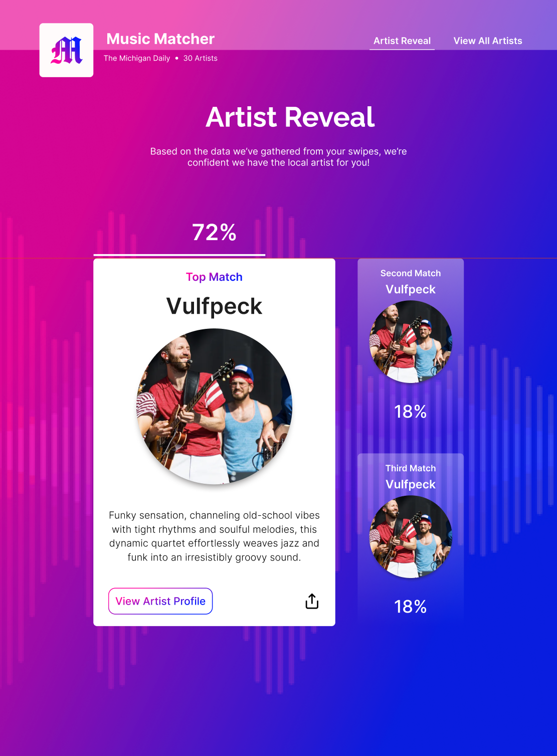
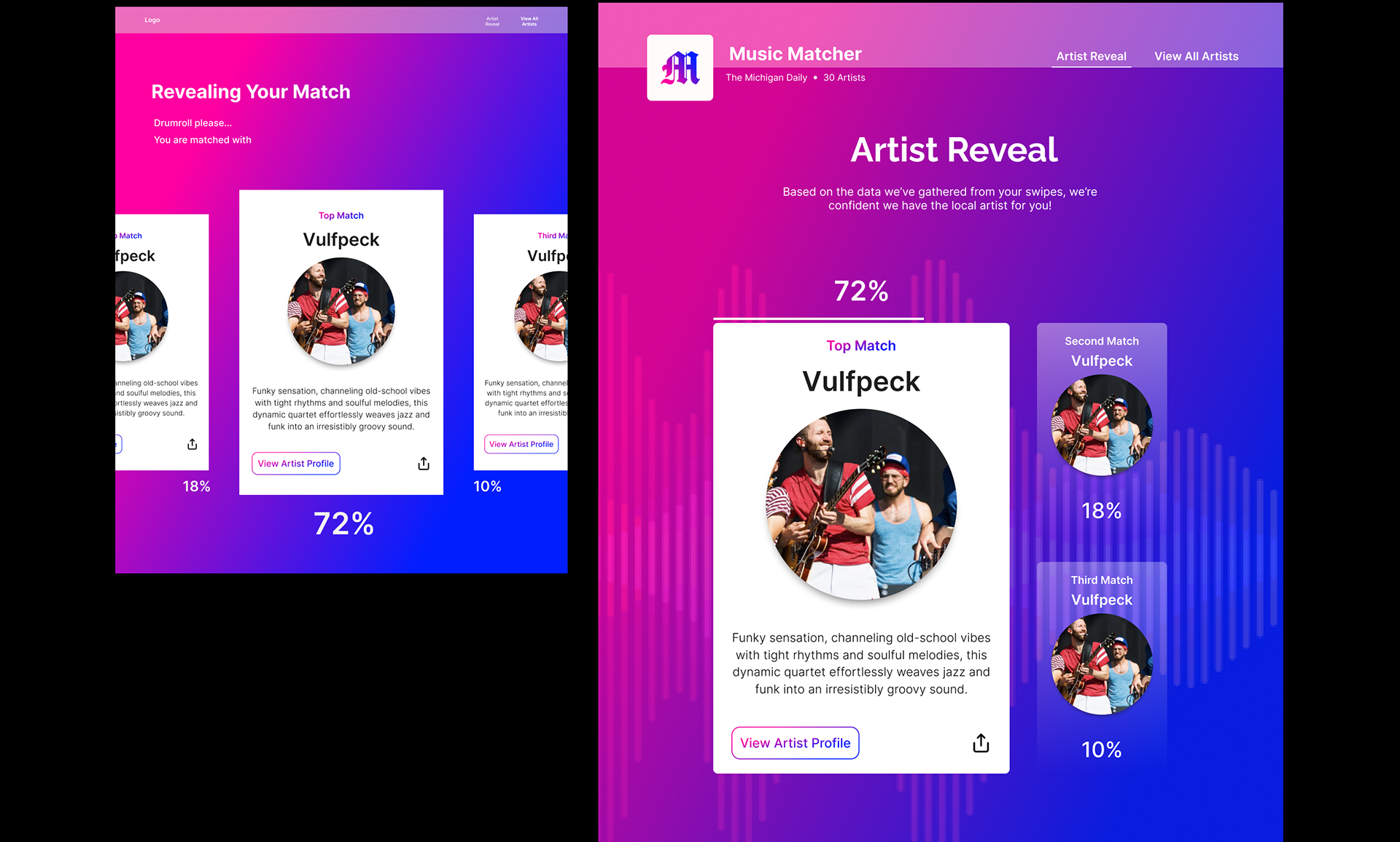
Grand Match Reveal
Upon completion of swiping, users' top three matches will be revealed along with the option to share their top match with friends.
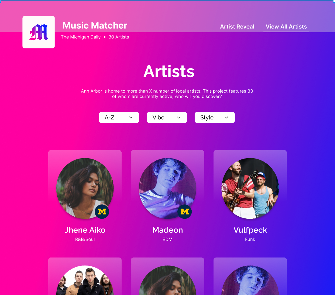
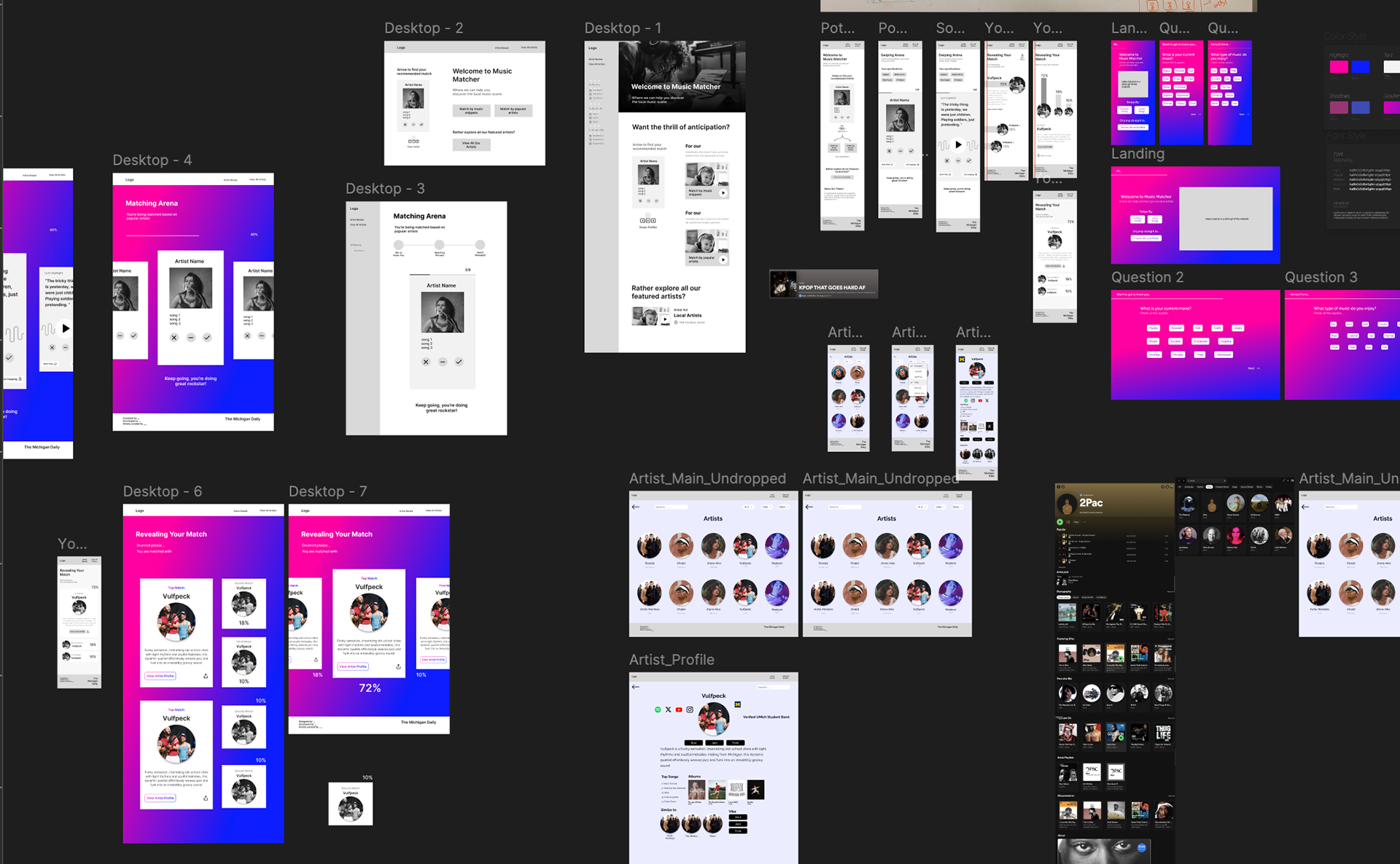
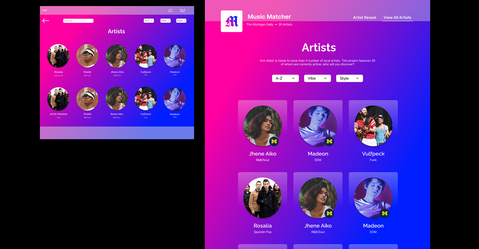
Browse Local Artists
Users can also browse all artists profiles within our curated list with three simple filters.
understanding music discovery
Context
Throughout the years, the music scene has been largely integrated into student life at the University of Michigan (Michigan Daily Articles: 2003, 2006, 2018, 2023). However, the spotlight is primarily on student musicians rather than all local musicians. In addition, there is no single resource with updated active status of musicians to refer to when expanding music discovery to local non-student musicians. AllMusic offers a list but not necessarily active status beyond entire decades (ie. 2010s - 2020s).
Early Vision
We went into this project with the idea of creating a dating app inspired tool in which users can slide different scales of pre-defined music factors for a single generated artist recommendation. With this in mind, our developers requested to have a set list of factors in which users evaluated new music. I advocated for value of further UX research to understand what music discovery currently looks like for students, how being in Ann Arbor affects this, and what influences students to attend live music events in the area. From this, our team dove into user interviews.
Interviews & Findings
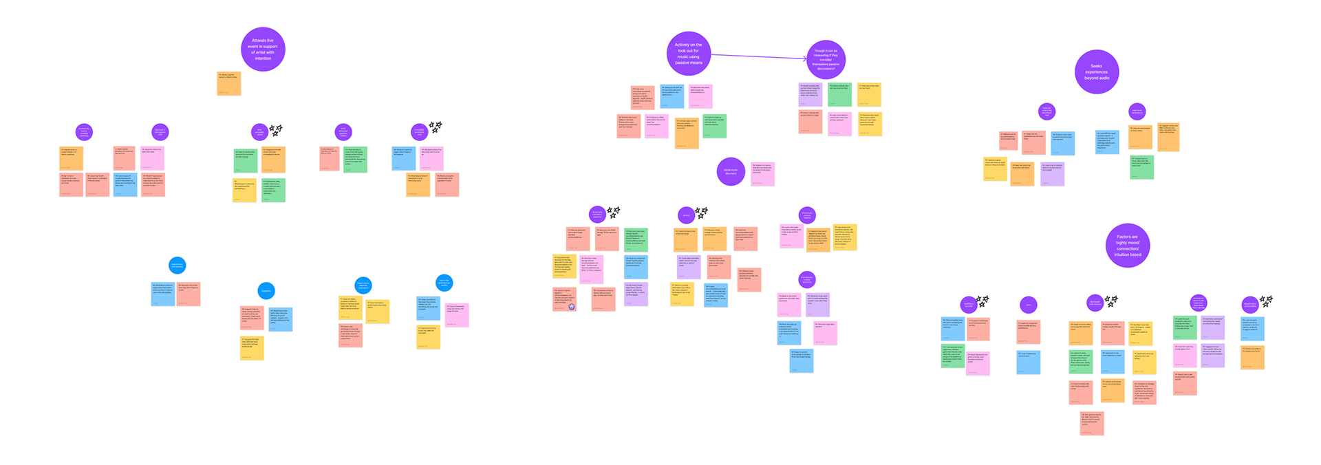
With the interview protocol I drafted, our team interviewed 7 UM students ranging from undergraduates to graduate students, in-state, out-of-state, and international, and music involvement (produces music/listeners/both), we created an affinity map that allowed us to gain the following insights:
• Students actively look for music through passive means (algorithms, social network, environmental exposure)
•. Factors that draw students to new music are highly mood, connection, and intuition based which make describing and labelling tough for participants
• Students attend live events with a reason for supporting the artist first (artist is a friend, is well-known, has a memorable personality), not necessarily just for the sake of attending music events
These findings were a surprise for our team — we'd come into this project with the hypothesis that listeners know exactly what they wanted and all we had to do was obtain a set list of criteria. However, these findings suggest that trying to create concrete sliding scales in which users would have to understand and adjust takes away from how students organically and intuitively discover music. Which brings us to the question of:
How might we design a tool that encourages UM students to discover local music on a passive and intuitive level to increase engagement?

defining what to build
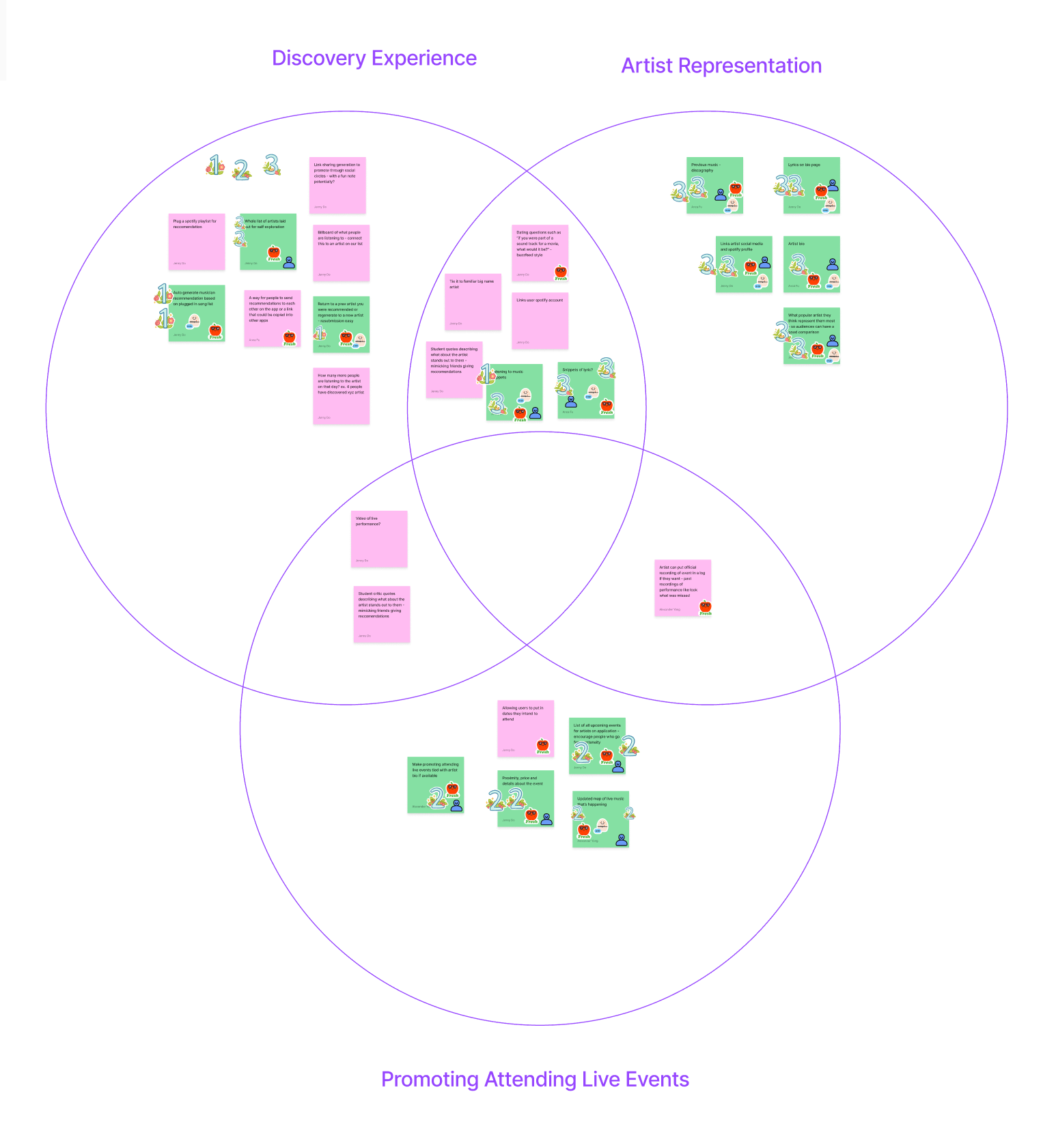
Brainstorming & Dot Voting
As some emerging themes were outside our influence as designers, I began starring those on our affinity map to narrow down the scope of what we would be able to address in our product. From there, I noted down the 3 areas we wanted to address through our design under which we rapidly brainstormed 27 features. Lastly, we sticker voted as a team to narrow down features as well as their priority.
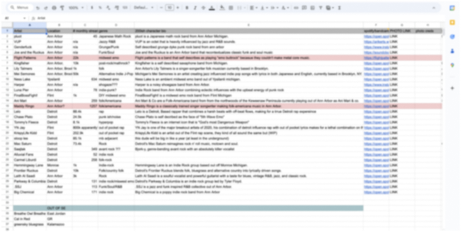
Content Audit
We received a list of featured artists our writers had directly verified to be active and had consented to be featured. From here, we reviewed what types of information our design needed to take into account, such as a 200 character bio, artist social medias, genre, etc.
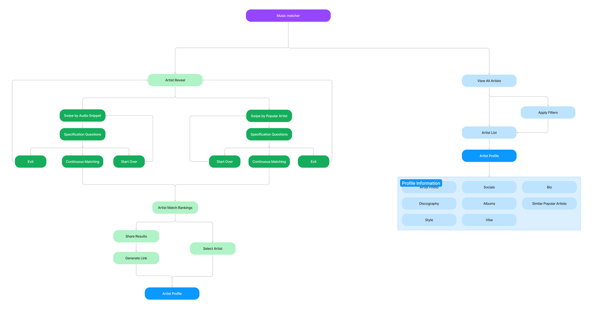
User Flow & Information Hierarchy
With our team on the same page as to what features and content the project would have, we mapped out our main screens and what each course of action would lead to. The main screens included an artist reveal feature and a page to browse all artists. With our first proposed site structure, we'd intended on incorporating a live map feature to promote attending local music performances.
Throughout the process, I was coordinating communication between development and design. I advocated for our team's idea of the live map feature, in which the main pushback from development was was lack of maintenance power in the long run. As such, development and design agreed it was lower in development priority and it was removed from the final hierarchy map.
Design process
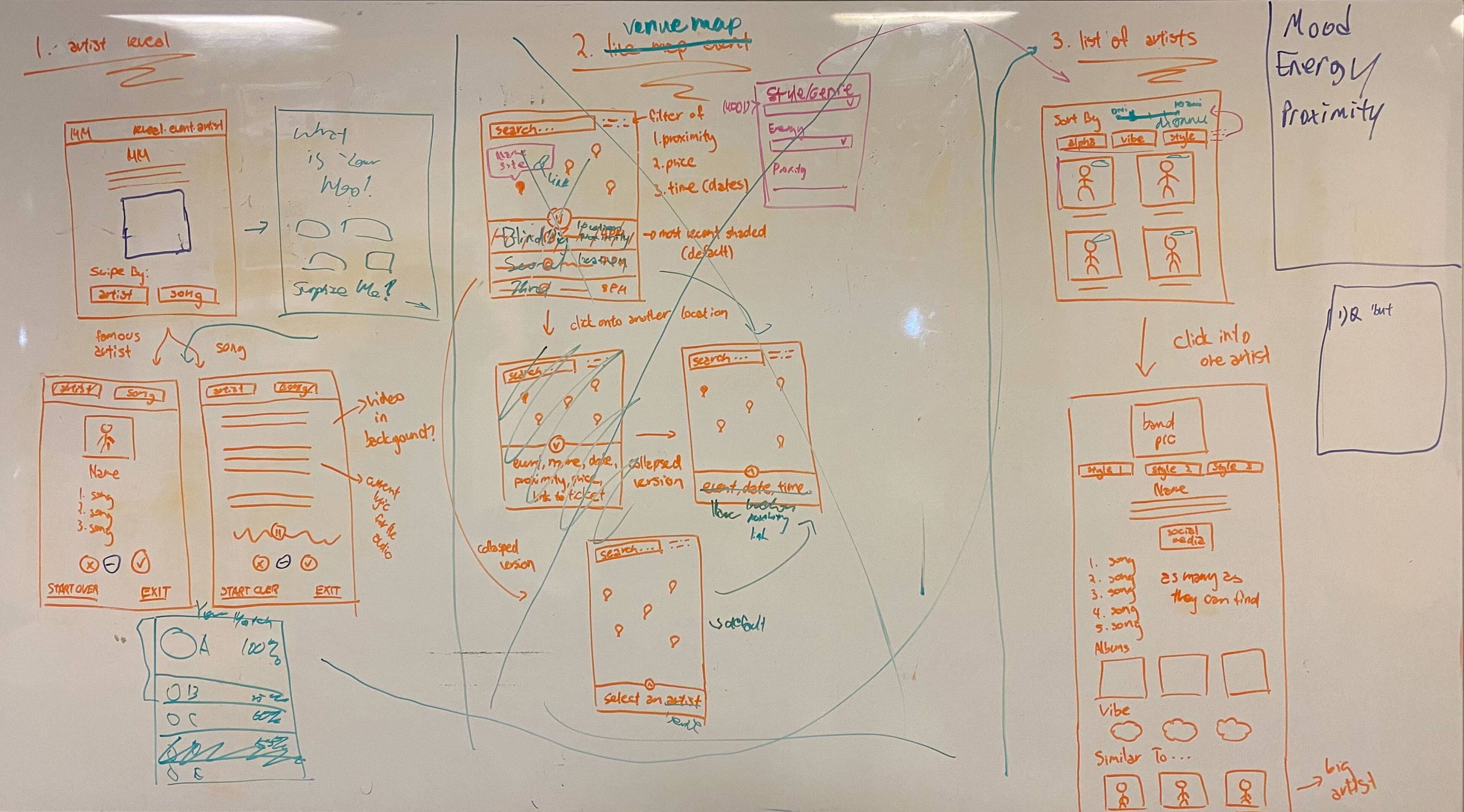
Initial Wireframes
Our team began sketching how the information would be presented on each screen on whiteboard. We were able to get development feedback as we sketched, which we were able to refine the included functionalities based on whether the student development team could execute on the backend. It was here that our team went back and forth on the live map feature. Despite most of the team acknowledging it was important, even if we could execute it, it was not worth development power if external sites will be more reliable when it comes to live updates.
My main role was to unify our design vision by communicating design pivots and articulating why it was worth leaving behind initial design ideas which, in this case, was the live map.
Mid-Fidelity
We transitioned into rapidly ideating on potential layouts in a higher fidelity, starting with mobile and expanding onto desktop. We wanted our site to mimic that of a music streaming platform, with the concept of the Michigan Daily sharing a "playlist" to the public and used Spotify's feel and layouts as inspiration.
Design Evolution & Decisions
I was responsible for editing final designs in which I incorporated visual elements such as transparent cards, spacing, font hierarchy, content order while also maintaining the team's original design work.
In this process, I'd learned quickly that we should have created a design guide in order to minimize the differences between each of our design approaches. However, this was a learning process in which the team's time and effort in the newsroom culminated — I couldn't be prouder!
Reducing Profiles per Row
• Showing less profiles at a time allows for less visual overwhelm and more focus on each profile
• Larger cards with subtle backdrop draws a more distinction between each profile
Chunking Profile Info
• Enlarging photo and name allows for clearer hierarchy
• Grouping pieces of related and separating unrelated items helps profile details be visually digestable
Leveraging Cognitive Map for Swiping
• Making clearer swiping action to users through left and right arrows
• Making current card more distinct by making it white and larger, which brings it forward visually
Emphasizing Top Match
• Gutenberg principle (right to left, top to bottom conventional reading path) establishes top, second, third match hierarchy
• Making top match card more distinct by making it white and larger and other matches smaller and transparent
If we had more time...
Conduct usability testing with the final prototype.
Due to the time constraint and how we had spent more time on defining what we would be designing, we did not have time to incorporate usability testing of some kind as I had set out for us. We only had design feedback within our team throughout the process so getting user feedback would would help us either validate or tweak our designs before handoff.
Interviewing more diverse students and expand on themes and insights.
Despite common themes being evident in our affinity map with 7 interviewees, there is still room for new insights to be generated as we had a lot of interview content that did not belong to any thematic groupings. Some groups I would love to speak to would be more graduate students and musicians as the music discovery process of those in our participant group were distinct to them.
Dig deeper into campus music sharing behavior and the sharing feature.
Due to the main project concept being a music matching tool, we spent the most time iterating and refining that aspect so sharing became secondary. However, we found that a huge aspect of music expansion and engagement was through personal network in our interviews. There is a lot of potential to tailor music sharing to the UM campus environment and music scene and we definitely could extend this project in that direction.
Takeaways
Identifying assumptions in the beginning can save time & effort.
I initially planned for us to draft a survey to post on the Michigan Daily Instagram with over 30k followers only for us to realize that we did not need numbers to confirm music discovery behavior we didn't yet understand. A survey would assume that users have a set criteria for evaluating new music and that we all we needed to do was compile a list of the most common factors, which we find to not be the case later on through interviewing.
Advocating for team ideas means to also understand factors beyond design.
There were a lot of times where I would meet with developers and entire feature ideas our team favored would get dismissed, sometimes due to feasibility or lack of importance or both. When I'd ask to understand about what steps developers would have to take and how this affected their decisions, we often are able to discuss alternative ways in which our team's ideas can still come to life while reducing strain on development.
Lastly, accounting for cushion time goes a long way.
It was my first time leading a longer team project! We definitely took longer in many phases I set out for us, including the interview analysis, standardizing designs, incorporating feedback, etc. Everyone on the team was juggling many student obligations outside of this project, in which I recognize I should have stripped down tasks I set for us based on priority and value for our time so we could get to usability testing of our MVP.